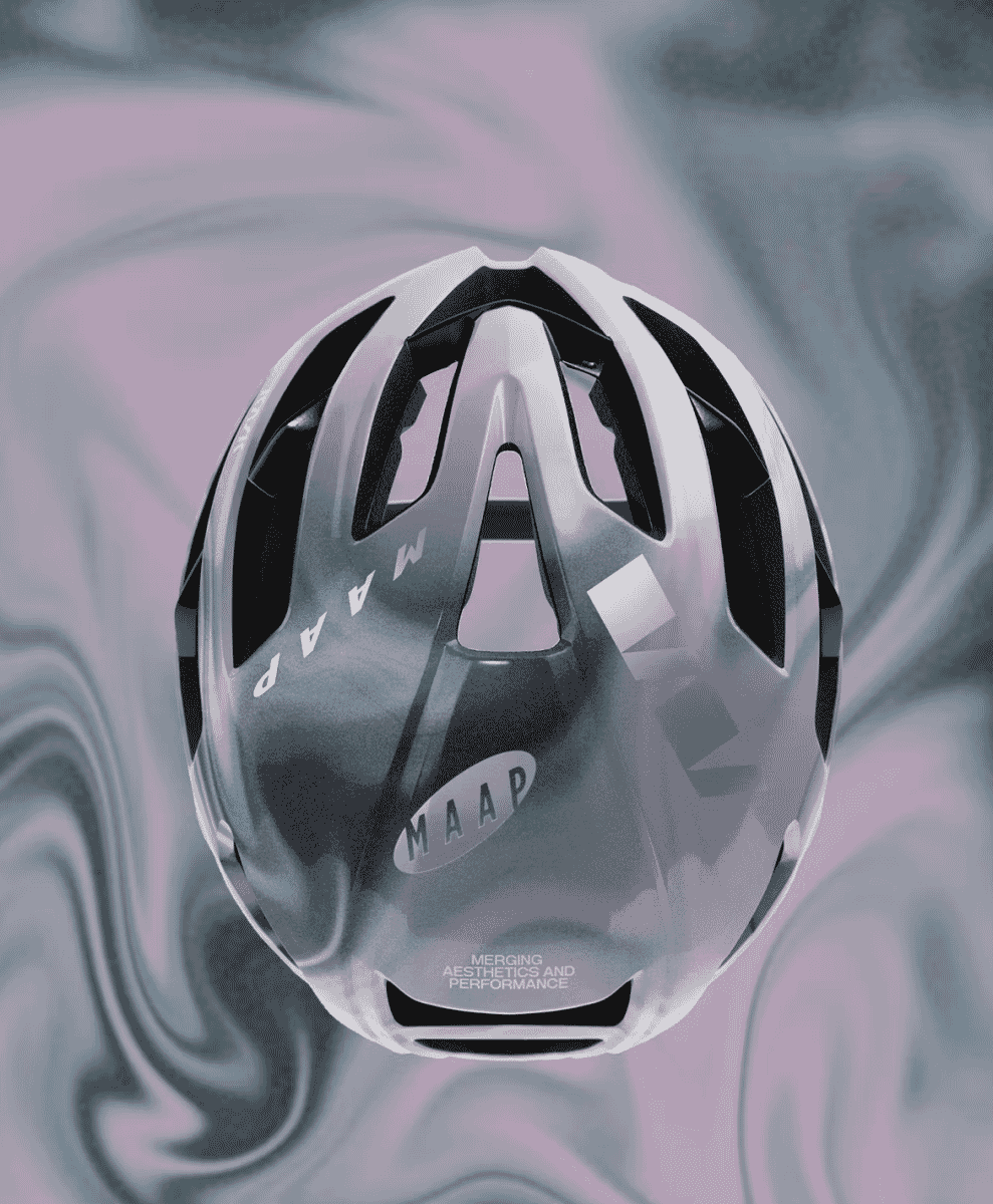
There are cycling helmets, and then there’s the KASK Protone Icon. This sleek, low-profile design has become a staple on roads from Roubaix to Richmond Park. Now, it’s been reimagined by MAAP, the Melbourne-based cycling brand known for its razor-sharp, aesthetically-conscious take on cycling apparel. The result? A limited-edition collab that blends looks and performance with the obsessive attention to detail that both brands are known for.
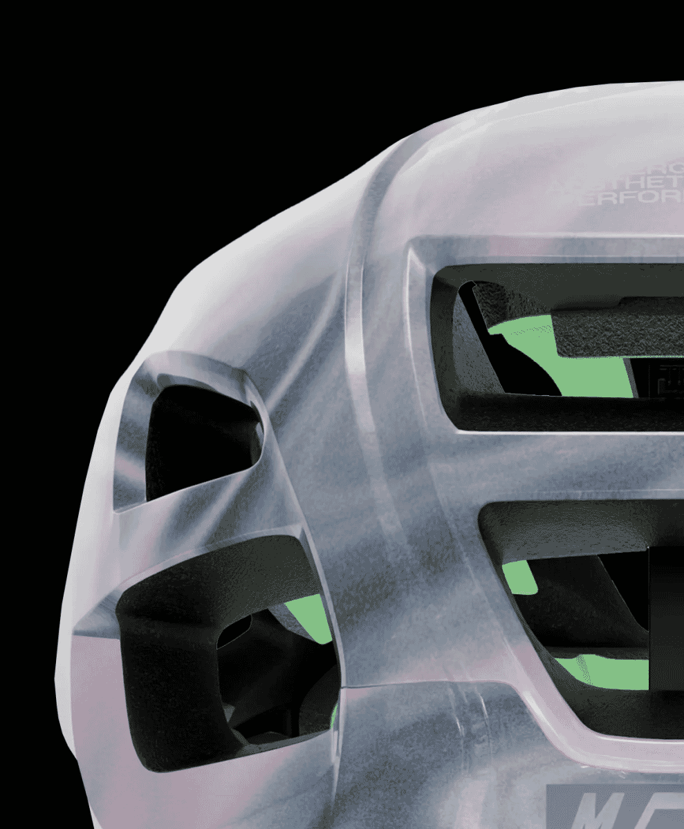
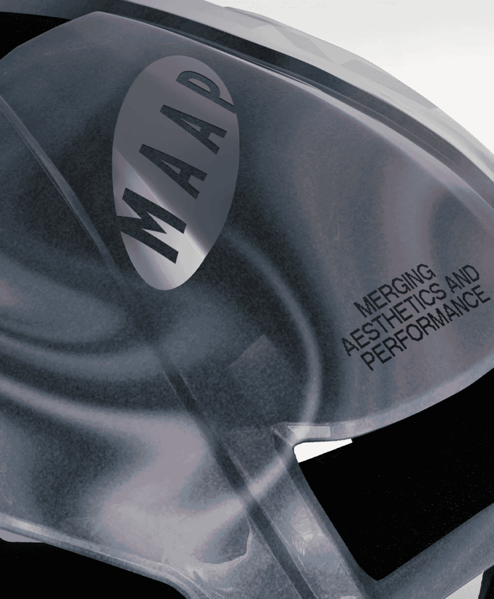
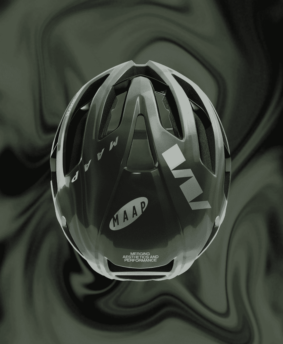
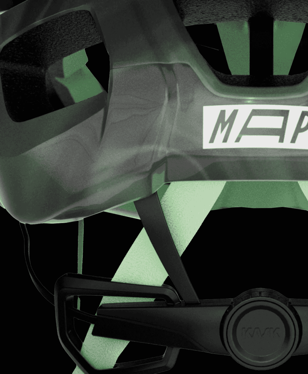
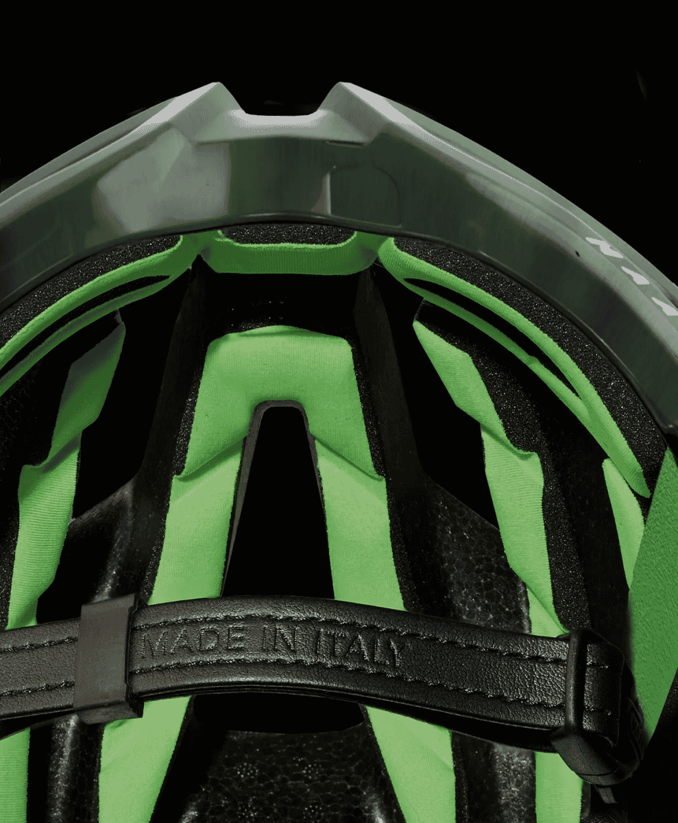
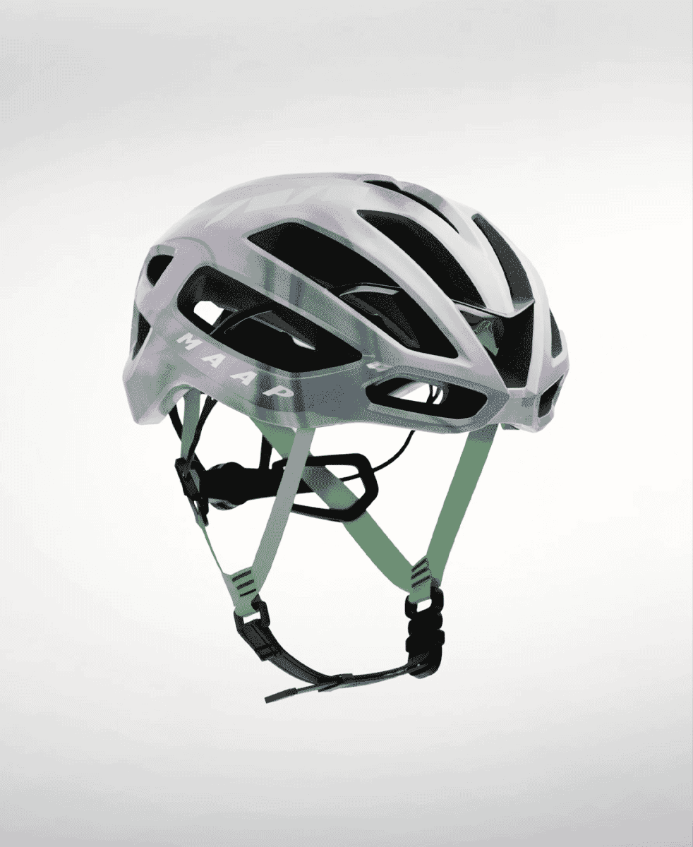
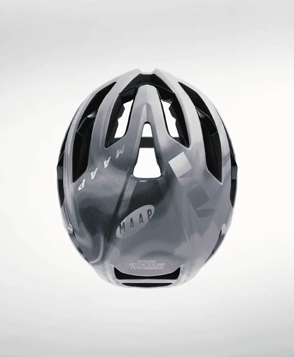
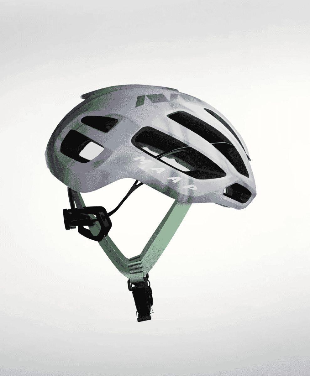
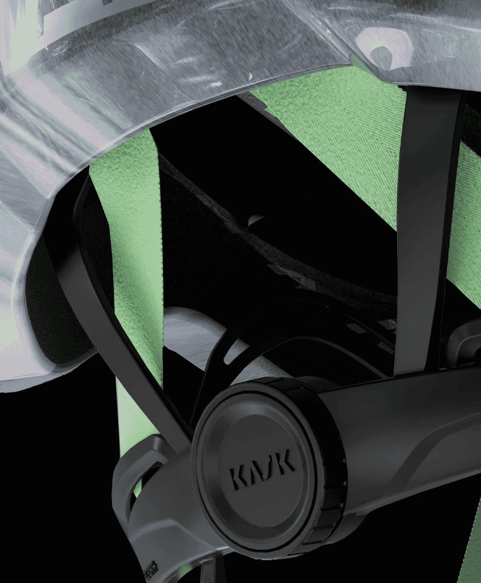
Dubbed Opal and Loam, the two new colourways shift the Protone Icon into fresh visual territory. Each helmet features MAAP-exclusive custom webbing, a black eco-leather chin strap, and pad-printed graphics. Subtle tweaks that elevate the design without screaming about it. But this isn’t just about looks. The Protone Icon remains one of the most technically advanced lids on the market, balancing featherweight construction with uncompromising protection. Whether you’re on the tarmac, churning up gravel, or testing your limits on CX trails, it’s built to handle it.
MAAP x Kask: A fitting union
KASK’s reputation in the cycling world speaks for itself. Designed and manufactured in Italy, the brand’s helmets are a mainstay of the pro peloton. Revered for their fit, performance, and attention to detail. The Protone Icon is arguably its most versatile model, offering exceptional ventilation and aerodynamic gains.
MAAP, meanwhile, has spent the last decade carving out a niche as the go-to label for cyclists who care as much about form as function. With technical fabrics, sleek silhouettes and an unapologetically design-led approach, it’s gear that looks just as sharp off the bike as it does in the saddle.
Together, MAAP x KASK make a natural pairing – two brands united by a shared obsession with performance, detail, and design. The result is a helmet that doesn’t just protect your head – it turns a few, too.
Next up: The alternative cycling apparel brands you should know.